Site philosophy and design principles
We wanted to design a site that is modern, joyful, accessible and easy to use, in keeping with the identity of our tradition. We are a tradition of modern Buddhism and our path is a joyful one. The design of the site must therefore convey this identity at first glance: it is not simply about presenting information, but about letting people feel the atmosphere of our centres and making them want to discover them.
The site has also been designed to meet the needs of two kinds of visitors effectively: people discovering the centre for the first time, and those who already come regularly. For a new visitor, the site must make it easy to understand quickly who we are, what we offer, who our activities are for and what atmosphere they can expect to find in the centre. For a regular visitor, who already knows the centre and is looking for a specific piece of information, it must on the contrary give quick and simple access to what they need: a time, an event, a class, the timetable, practical information, and so on.
The whole design of the site therefore rests on this balance: helping new visitors discover the centre and making them want to come, while allowing regular visitors to quickly find the information they are looking for.
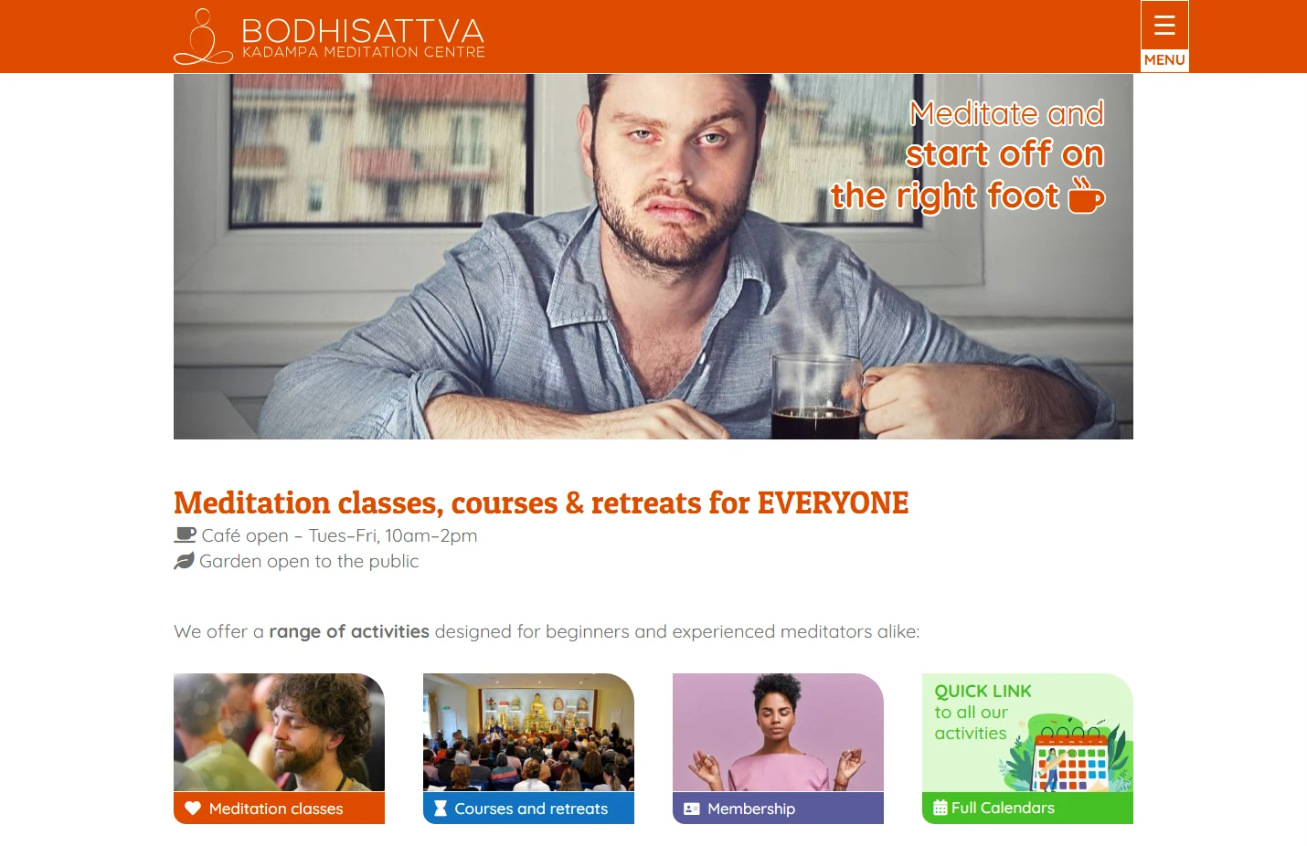
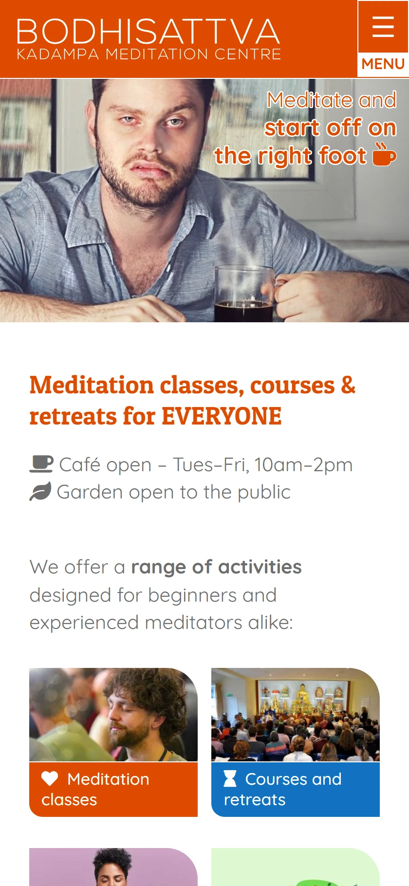
To see at a glance how the home page is built, here is an example of a full page based on the Brighton centre. Each section is detailed below.
See the whole home page at a glance

A modern and joyful visual identity
Orange was chosen as the main colour of the site. It is a colour associated with wisdom and with our tradition, but it also creates a warm and lively visual identity.
The shade chosen is deep enough to ensure good contrast with white, which helps readability and comes as close as possible to the principles of web accessibility. It is a compromise between accessibility and aesthetics.
Around this main colour, we have defined a palette that also includes blues, purples and greens.
This palette provides a common framework while leaving the centres some freedom. A centre such as Brighton, for example, chose blue as its main colour to stand apart from another centre already using orange. What matters is to stay within the defined palette, so as to keep visual consistency across all the sites that use this system.
Where to act
The site colours explains how the palette works; the Colours screen and the task Change the site colours show how to set it.
A simple, instantly recognisable interface
The site header has deliberately been designed to be very plain. The centre's logo appears at the top left, in white on an orange background. At the top right, the menu button always stays in the same place.
We chose to add the word "Menu" to the traditional "hamburger" icon. This makes the purpose of the button clearer and helps make navigation more accessible to everyone.
The menu keeps the same principle and the same position on both computer and mobile. Visitors therefore always find the same landmarks, whatever device they use. This continuity makes the site more consistent, simple and intuitive to use.
Where to act
The site menu explains how the menu is built; the Site menu screen and the task Edit the menu show how to change it.
Images designed to work everywhere
To make layout easier and ensure a consistent presentation across the whole site, we also chose to standardise the format of the main images.
The image format: 1050 × 400 pixels
The images used at the top of the home page, of content pages, of event pages and in various other areas of the site are prepared in the 1050 × 400 pixel format.
This panoramic format shows the image off well while letting the first pieces of information below it appear quickly.
This choice works particularly well on both mobile and computer: the image remains visible and attractive without taking up the whole screen, so visitors can get to the content quickly.
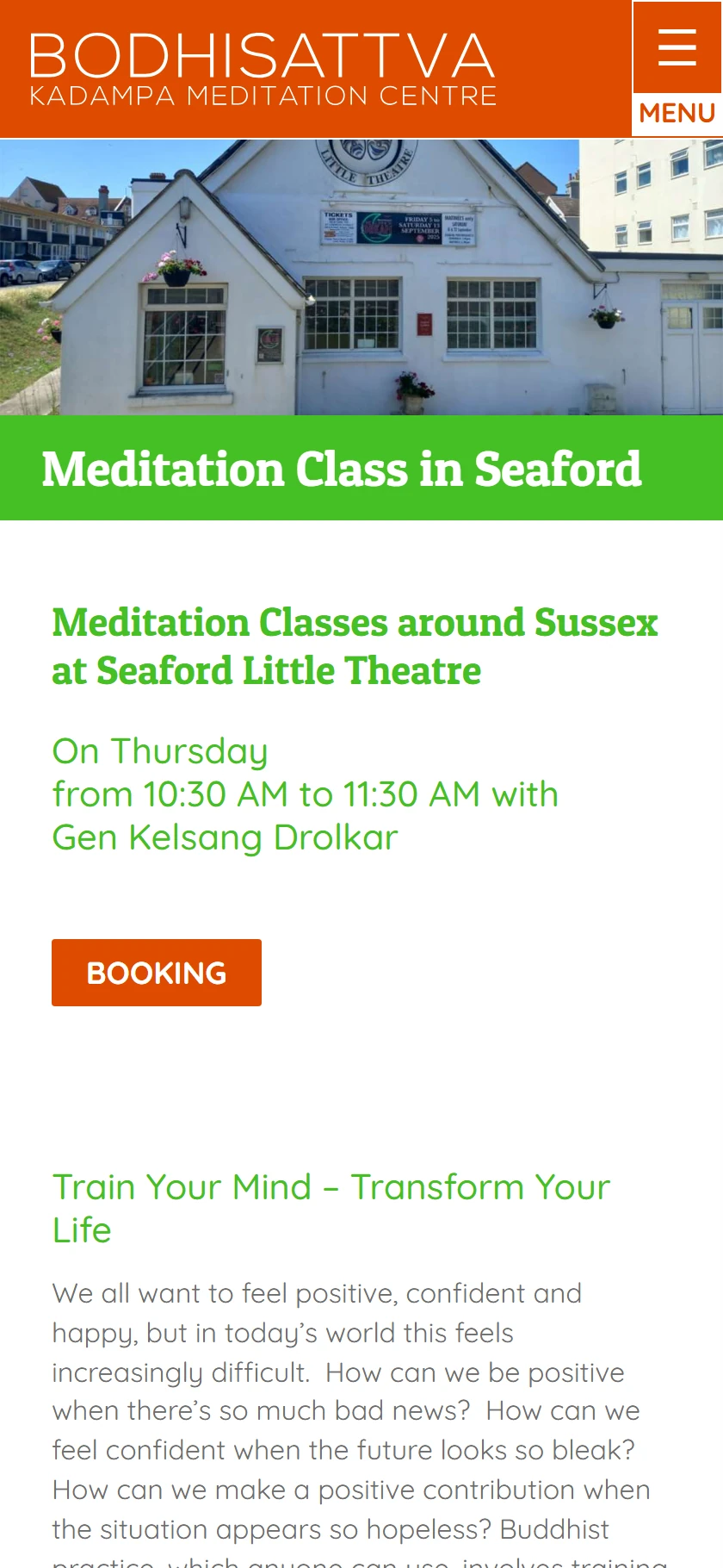
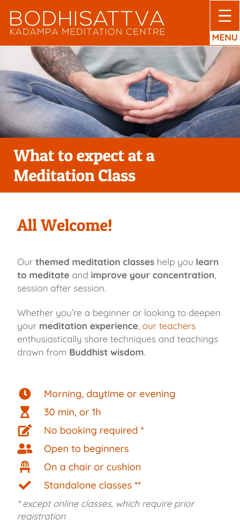
Using a fixed format also makes graphic design considerably simpler. Rather than having to handle images displayed full width or full screen, with different cropping constraints depending on the device, you only need to prepare the image properly once.
Once it has been cropped, it can be used reliably in the various places on the site: main images, upcoming events, thumbnails and blog posts. This gives a consistent presentation while making the day-to-day running of the site much simpler, without requiring advanced graphic design skills.
The home image: creating a positive first impression
The image at the very top of the home page plays a special role. It is aimed above all at people discovering the site for the first time.
Its purpose is therefore not simply to illustrate the centre. It must create an immediate, positive first impression:
"Oh, this looks nice!"
This impression must come from both the design and the message the image conveys. The choice of picture, text and composition should give an idea of the atmosphere of the centre before the visitor has even started looking at the various activities on offer.
This first hook is also an opportunity to show what characterises our approach. We are a modern and joyful Buddhist tradition, and our centres can convey this at first glance. Humour, lightness and lively messages therefore have their full place in these visuals.

The aim is to show a reality that visitors can find in our centres: places that are welcoming, lively, warm and accessible. Someone who does not yet know our tradition should be able to think straight away:
"Maybe this is a place for me."
To make these visuals easy to create, a dedicated module has been developed so that a home image can be put together very simply from a picture, a text and one or more icons. The module also lets you adjust the presentation and preview the result on mobile directly.
You can create several home images, which will then be shown at random. Someone coming back to the site may thus discover a different hook, which gives a sense of novelty and keeps the home page alive.
It can be worthwhile, for example, to create around ten images over a few months or a year, depending on how much time the centre wants to devote to this. This work is not merely decorative: this first hook is one of the very first opportunities to create a connection with someone discovering the centre.
Viewing an image before publishing it
The site picks at random among the published home images; a draft image is never shown to visitors. To judge a new image in real conditions before publishing it, use the View on the home page button on the edit screen: only you then see the home page with this image.
Where to act
The Home image screen shows how to compose an image.
A home page that naturally guides visitors
After this first hook, a title presents the centre's activities very simply and reminds visitors that they are open to everyone.

Just below, a sorting area lets visitors quickly find their way to the main content of the home page. It can offer, for example, entries for meditation classes, weekend events, subscription options and, in fourth position, access to the centre's calendar.
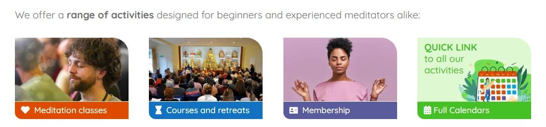
This last entry is particularly important, because the calendar is often among the information most sought after by people who already know the centre or simply want to know what is going on there.
When visitors select one of these items, they are taken straight to the matching part of the home page. There they find a short presentation of the activity, and can then go to the page devoted to it for more information.
This organisation therefore lets people discover the centre's activities without always having to go through a menu. The home page becomes a real journey of discovery: everyone can either go straight to what interests them, or simply scroll down the page and gradually discover everything on offer.
A home page also designed for search engines
This organisation also has a significant benefit for search engine optimisation.
The home page contains content about the centre's various activities, with the words and phrases that match what people search for online. Each presentation can then link to a fuller page about the activity in question.
The home page thus becomes a starting point towards the other content on the site and creates consistent internal linking.
The same structure therefore serves several purposes: it makes navigation more intuitive for visitors, enriches the home page with useful content and helps search engines discover the other pages of the site.
Showing the life of the centre straight away
Just after the sorting area, a section presents the events planned for the next few days. Visitors can thus see straight away what is happening today and over the following days, without needing to open the calendar.
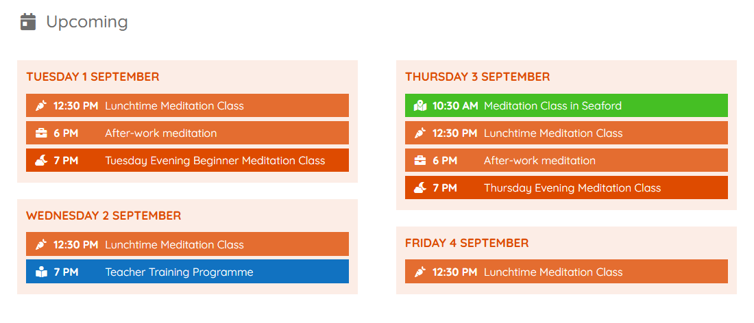
The rest of the page then lets visitors naturally discover more about the centre simply by scrolling down (the monthly subscription options, for example).
Where to act
This section is an "Upcoming" block: see the Upcoming blocks screen and the task Show upcoming events on a page.
Putting the teachers in the foreground
A carousel also presents the teachers and immediately shows the faces of the people who give the teachings.
On the home page, the order is deliberately random. On each visit, the teachers may appear in a different order, which makes the presentation more lively and regularly highlights different teachers.
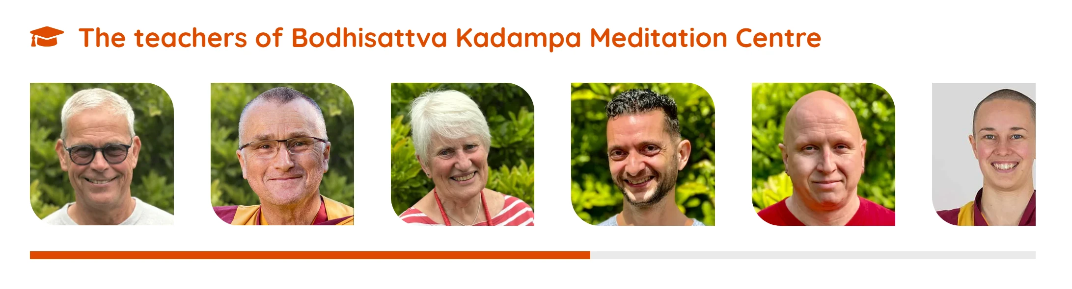
The teachers page is organised differently. The resident teacher is shown first, with a larger photo. The other teachers then follow in the order chosen by the EPC.
Where to act
On the teachers page, the order is that of the list of teachers in the admin: see the Teachers screen.
Giving an immediate view of the timetable
Further down the home page, the weekly timetable of meditation classes shows at a glance how the classes are spread over the week.
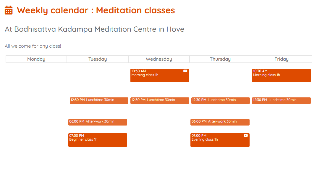
It distinguishes the different times of day, in particular morning, lunchtime and evening classes. Visitors can thus understand very quickly when the various sessions take place.
If needed, a second timetable can also present the classes held in branches.
This presentation gives a very concrete picture of the life of the centre and makes it easy to quickly find a time slot that suits one's availability.
Where to act
The Weekly timetable screen and the task Update the weekly timetable.
The footer: informing and connecting the sites
The footer, present on every page of the site, is not simply a technical area. It can also serve as a space for information, building loyalty and networking.
Google reviews are included there to present a selection of comments genuinely left by visitors. They bring a human dimension to the site and directly show the experiences shared by the people who come to the centre.
This area also offers a button that lets visitors leave a review themselves.
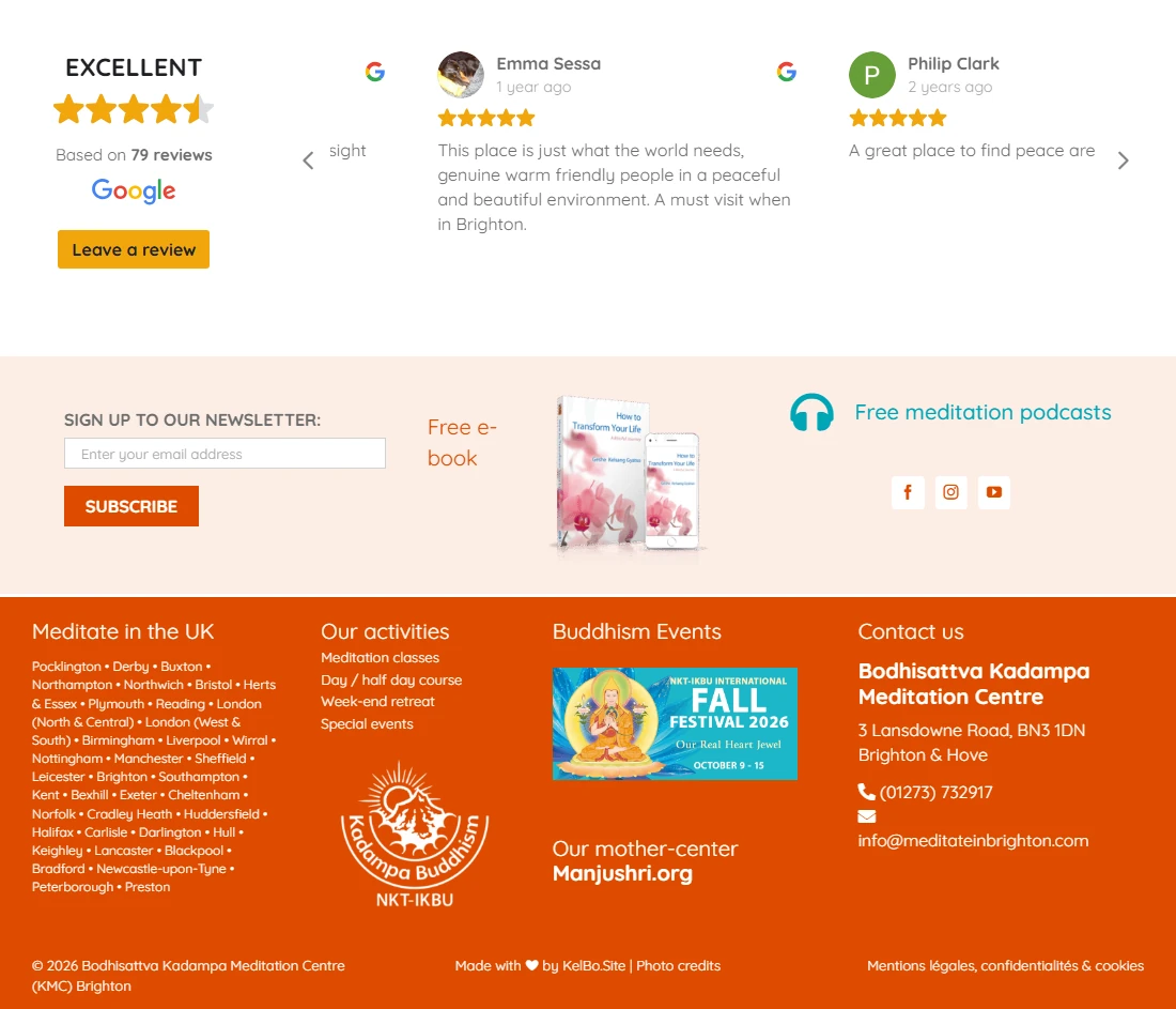
The footer can also give access to the newsletter sign-up and offer additional resources, such as free e-books or podcasts.
Finally, this space is a particularly good place to create links to the other Kadampa centres in the country. Ideally, the different sites would adopt the same approach and link to one another.
This would create a real network of links between the sites, useful both for visitors who want to discover another centre and for the overall structure of the network. A link to the national centre can also be included in this approach.
Where to act
The footer is a layout template: see the Layout screen. To hide or highlight a Google review: see the Google reviews screen.
A design that brings together aesthetics, simplicity and effectiveness
All these choices ultimately follow the same logic: to create a site that is pleasant to look at, simple to use and representative of the identity of the centres, while being easy to develop and to run.
Visitors must be able to understand straight away where they are, what is on offer, when the activities take place and how to go further. They can choose to look up a specific piece of information directly, or simply let themselves be guided by scrolling down the page.
At the same time, the structure of the site makes it possible to develop rich content, to create consistent links between the different pages and between the different sites, and to gradually strengthen search engine optimisation.
Design is therefore not separate from usability, content or search engine optimisation: all these elements have been designed together to create the experience of a site that is modern, joyful, accessible, smooth and effective.