Site menu
Where: Menu menu of the administration. Who: administrators and editors.
This is where you build the site's sliding menu: the one that opens when visitors click "MENU" at the top of the page. You decide which elements make it up, their order and their hierarchy (an element can contain sub-elements).
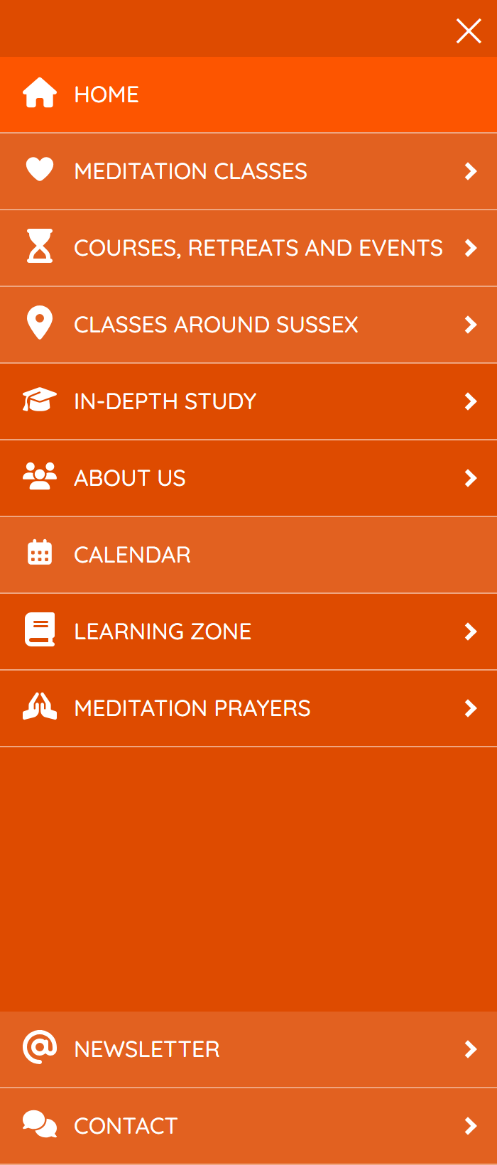
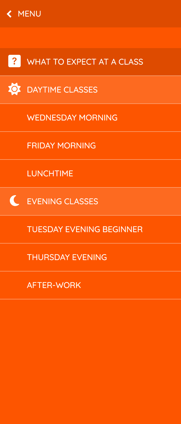
On the left, the menu; on the right, a submenu opened from one of its entries.
A menu element is set in two places:
- this screen is used to create, remove, order and indent the elements;
- the element's screen (✎ button) is used to set its content: title, link, icon, highlighting…
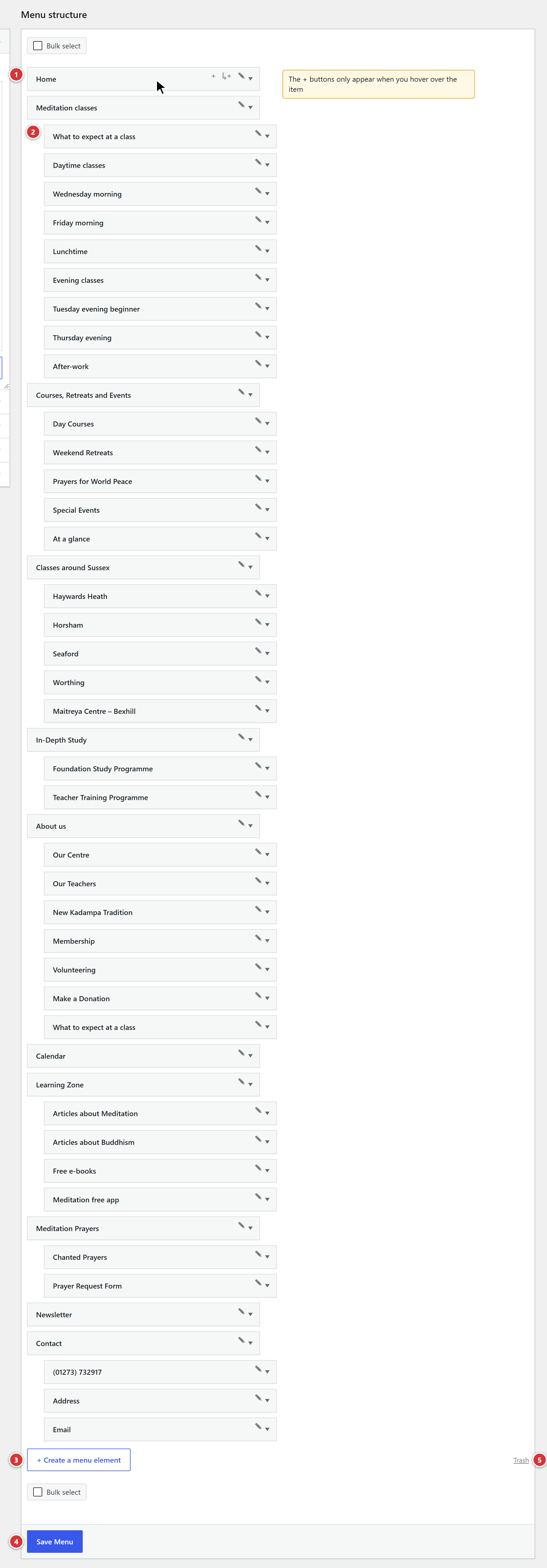
1 A menu element, with its three buttons. 2 A sub-element, slightly indented. 3 Create a menu element: adds an element at the root of the menu. 4 Save Menu: only needed after reorganising the elements. 5 Trash: the removed elements.
Understand in one minute
- Each menu element is a small edit screen (title, link, icon…) that you open with the ✎ button.
- This screen only shows the list of these elements, in the order in which they appear on the site. To change the order, you drag and drop the lines.
- Creating or removing an element takes effect straight away: there is nothing to save. Only the order needs saving.
The buttons of an element

1 +: add an element at the same level. 2 ↳+: add a sub-element. 3 ✎: edit this element. 4 The arrow on the line opens the Move and Remove commands.
| Button | Tooltip label | What it does |
|---|---|---|
| + | Add an element at the same level | Creates an element just after this one, at the same level, and opens its edit screen in a new tab. |
| ↳+ | Add a sub-element | Creates an element inside this one: it will appear in the submenu. |
| ✎ | Edit this element | Opens the element's edit screen (see The edit screen of an element) in a new tab. |
An element that has just been created and has not yet been given a title is called New element and is marked draft: it is not shown on the site until you have published it.
Create an element
- Click + Create a menu element, below the list, to add an element at the top level of the menu. For an element next to another one, or a sub-element, use + or ↳+ on the line concerned instead.
- The New element line appears in the list, and the element's edit screen opens in a new tab.
- On this edit screen, give the element a title, set it up (see The edit screen of an element), then click Publish.
- Go back to the Menu tab: the element's title is already up to date in the list.
If the element could not be created, the message The element could not be created. appears: reload the page and try again.
An element created by mistake
A New element that you have never filled in is moved to the trash automatically after 24 hours. You can also remove it straight away.
Reorganise the elements
- Drag and drop a line to move it up or down.
- Drag it slightly to the right to make it a sub-element of the line above; drag it to the left to bring it out of a submenu.
- You can also open the line with the arrow, then use the Move commands (up, down, under an element, out of a submenu).
- When you have finished, click Save Menu, at the bottom of the screen.
Do not forget \"Save Menu\"
A new order is only taken into account after this click. If you leave the screen without saving, the elements go back to their old place on the site. Creating, removing or editing an element, on the other hand, does not need this button.
The At the bottom setting on an element's edit screen (see below) places that element at the bottom of the menu, whatever its place in the list.
Remove an element
- Open the element's line with its arrow.
- Click Remove.
- A message asks for confirmation: Removing this item will also move its content to the trash. Continue? Click OK.
The element disappears from the menu immediately, without saving. Its edit screen is moved to the trash: the Trash link, below the list, takes you there if you want to recover it.
The sub-elements of a removed element move up one level: they do not disappear with it.
To remove several elements at once, tick them and use the bulk action; the same confirmation message appears (Removing these N items will also move their content to the trash. Continue?).
The edit screen of an element
The ✎ button opens the element's edit screen in a new tab. It contains:
- the element's title, as it appears in the menu;
- a Menu box with the settings below;
- depending on the type chosen, a large content editor (see Displays content).
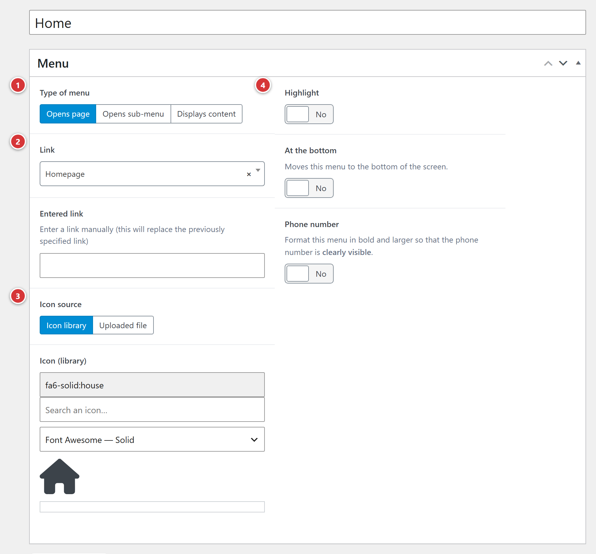
1 Type of menu. 2 Link or Entered link. 3 Icon source and icon. 4 Highlight, At the bottom, Phone number.
After making changes, click Publish (or Update): the site is up to date straight away, without going back through Save Menu.
Type of menu
Three choices, which decide what the element does when visitors click it.
| Type | What visitors see |
|---|---|
| Opens page | Clicking the element opens a page of the site (or an address of your choice). |
| Opens sub-menu | Clicking the element opens its sub-elements. A small arrow shows this. |
| Displays content | Clicking the element shows a text, a map, an address… in the menu (see below). |
Opens page
Two fields appear:
- Link: choose a page of the site from the list (type the first letters of its title to find it).
- Entered link: to point to an address that is not a page of the site, for example another site, paste it here. Exact label of the field: Enter a link manually (this will replace the previously specified link). If this field is filled in, it takes precedence over the Link field.
An element with no link at all leads nowhere: clicking it does nothing.
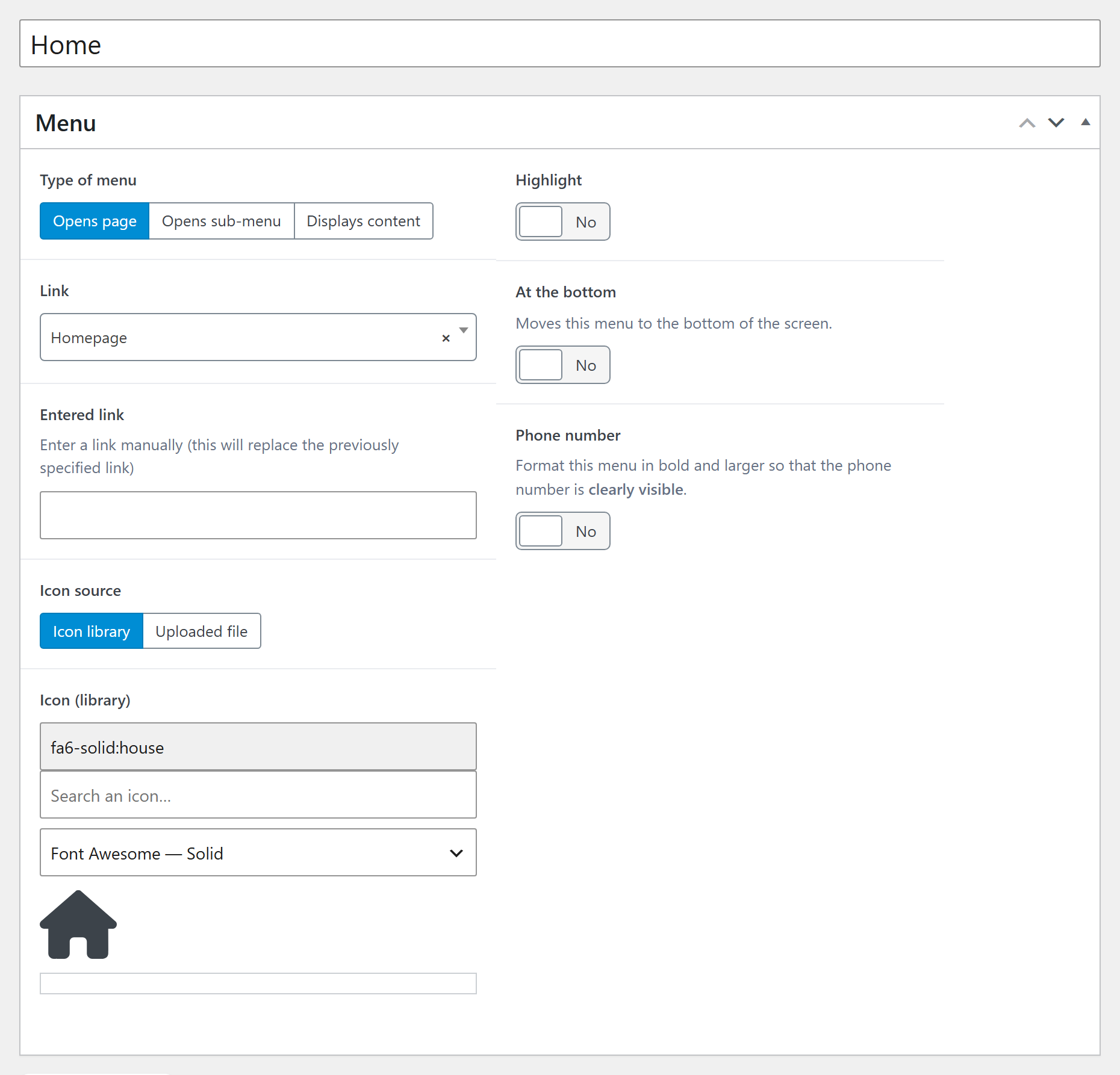
Here, the Home element leads to the home page (Homepage); the Entered link field is empty.
Opens sub-menu
The element acts as the heading of a group: its sub-elements (created with ↳+) appear when visitors click it. Neither Link nor Entered link needs to be filled in: when you choose this type, these two fields disappear from the edit screen.
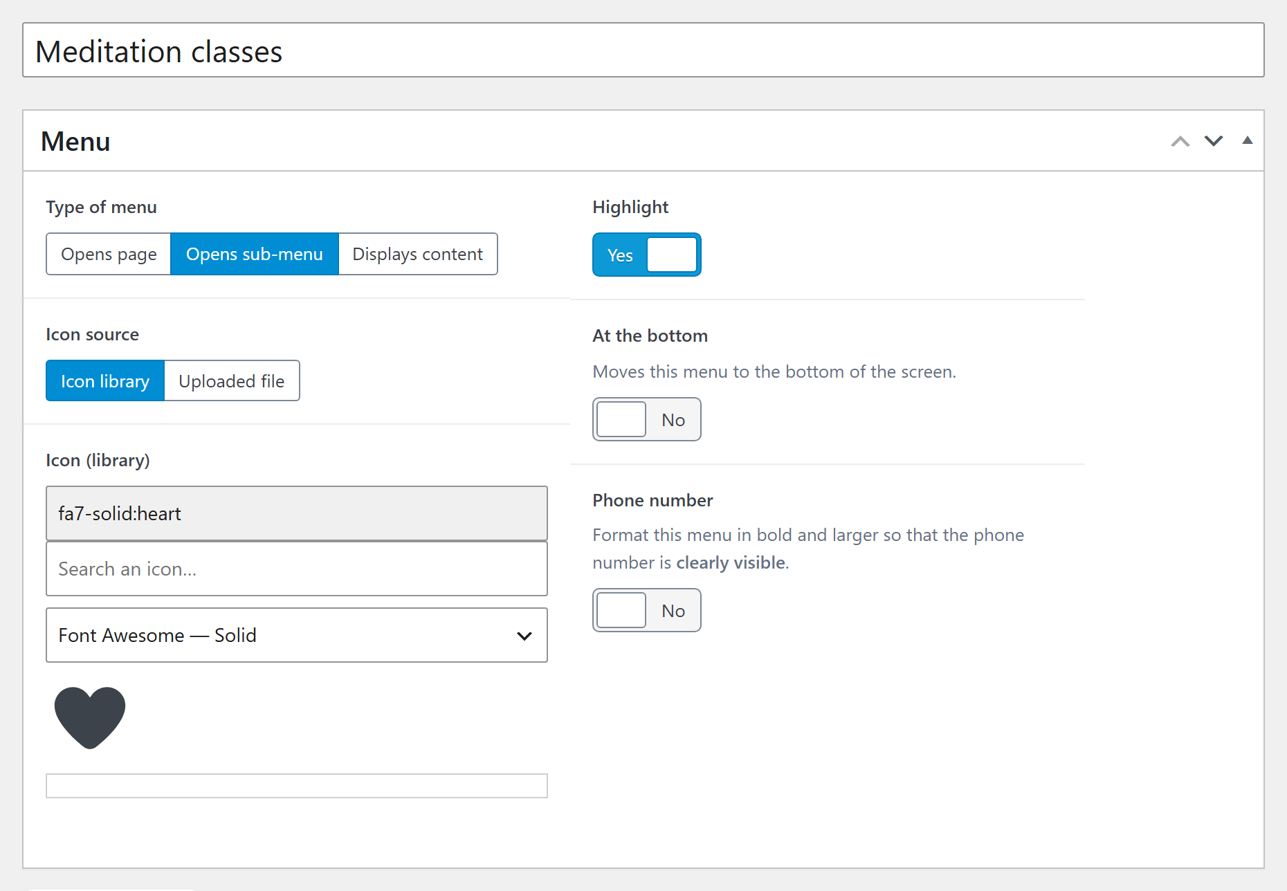
Here, the Meditation classes element: the edit screen goes straight from Type of menu to Icon source, with no Link field. It is also highlighted (Yes), which is set independently of the type.
Highlight
A highlighted element gets a slightly lighter background than the other elements of the menu, to catch the eye. As you can see in this preview of the menu, the background of some elements (such as "CALENDAR", for example) differs from that of its neighbours. This setting exists for all types of element (see Highlight, At the bottom, Phone number).
Displays content
Instead of a page, the menu shows the content written on the edit screen: the content editor, below the Menu box, is used to compose it. An address with a map, an introduction, opening times… This content is laid out with the site's page builder.
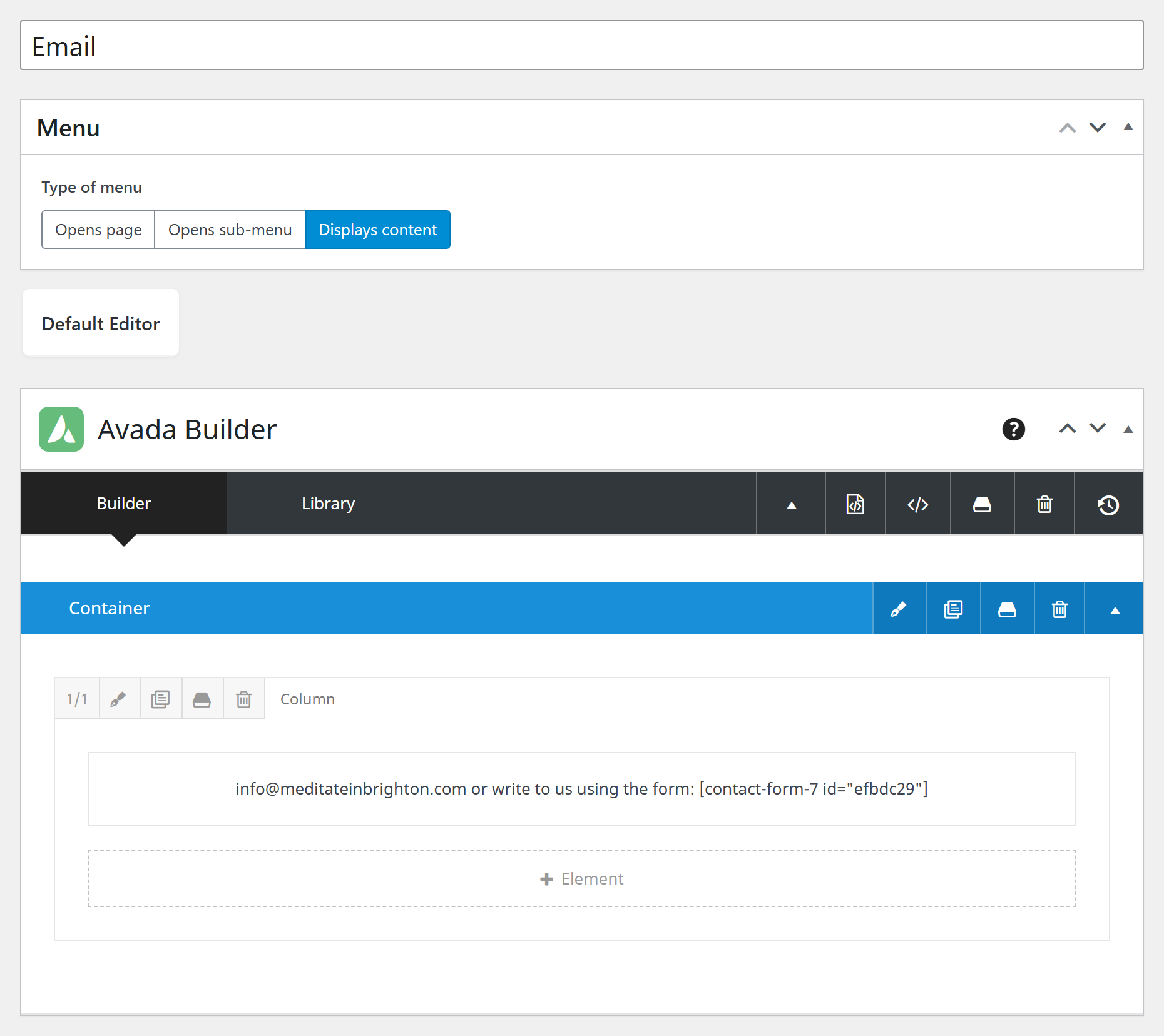
Here, the Email element: below the Menu box, the page builder (Avada Builder) contains the text that will be shown in the menu.
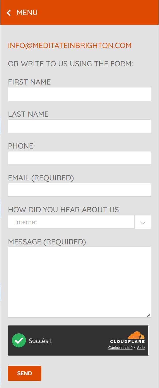
Here is the result on the site: clicking Email opens, in the menu, the address and the contact form. The MENU button, at the top, takes you back to the list of elements.
Icon
The icon is shown in front of the element's title.
- Icon source: Icon library (default choice) or Uploaded file.
- Icon (library): a search box, Search an icon…, lets you find an icon among several libraries (Font Awesome, Tabler Icons, Lucide, Phosphor, Material Symbols, Bootstrap Icons). The All libraries selector widens the search. Click the icon you want to choose it.
- Icon (field shown with Uploaded file): upload, or choose from the media library, an image (jpg, png, gif, ico or svg).
The library offered by default is set in Settings > Advanced (Menu icons section, Default icon library setting); see Advanced.
Possible messages
No icon found.: the search gives nothing, try a shorter word or All libraries. Could not retrieve this icon. Please try again.: a passing problem, choose again.
Icon's SVG
The Icon's SVG field is filled in automatically when you choose an icon. Do not change it by hand.
Highlight, At the bottom, Phone number
Three switches, off by default:
| Setting | Effect on the site |
|---|---|
| Highlight | The element gets a slightly lighter background than the others, to catch the eye (for example for "Donate"). |
| At the bottom | Moves this element to the bottom of the screen, apart from the others. Only applies to elements at the top level of the menu. Exact label: Moves this menu to the bottom of the screen. |
| Phone number | The element is shown in bold and larger, so that the number is clearly visible. Use it for an element whose title is a number. |
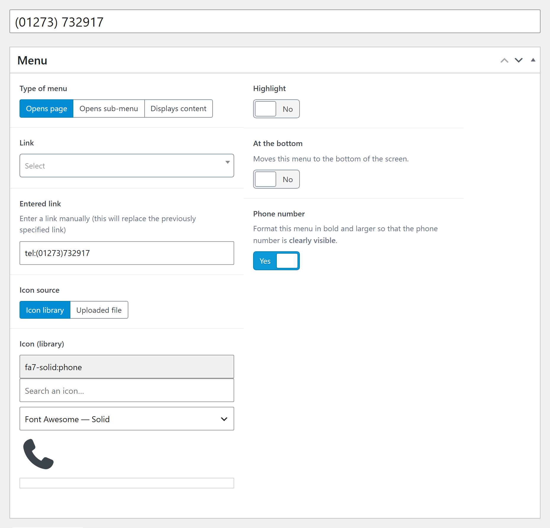
For a clickable number, the element is of the Opens page type, its Entered link is the
number preceded by tel: (here tel:(01273)732917), and Phone number is set to Yes. On a
phone, tapping the element starts the call.
The colour and width of the menu
These settings are not on this screen:
- the colour of the menu and of the submenus: Colours;
- the width of the sliding menu: Settings > Advanced, Site menu section, Menu width (px) setting. It is automatically limited to the width of the screen on small devices.
Frequently asked questions
I created an element, but it does not appear on the site. It is probably still a draft: open its edit screen with ✎ and click Publish.
I changed the order of the elements, but the site has not changed. Click Save Menu. A new order is only taken into account after this click.
I removed an element by mistake. Open Trash (below the list) and restore the element's edit screen: the element reappears in the menu, in its original place, as it was before.
Why is there no "Title" or "Link" field on this screen? Because everything is set on the element's edit screen (✎ button). This screen is only used for organisation.
Can I have several menus? No, the site has only one sliding menu.